Thursday, June 9, 2016
Contrast, Harmony, and Balance
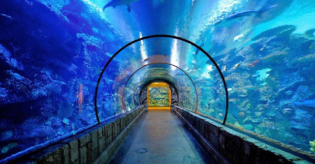
When I first saw this image it immediately made me think of the time I took my kids to the shark reef in Las Vegas. The yellow at the end of the walkway contrasts the overall blue of the rest of the image. The left side is a bit more shadowed and offers a deeper blue, again contrasting with the lighter blue, or less shadowed, water on the upper right and right side of the tank. The two white areas almost dead center in the upper portion of the image are representative of some form of light fixture, either natural or man made. Your eye is immediately drawn to the yellow square. The curvature of the tank offers a balance within the image. The two heavy lines on either side of the walk way offer a balance through the bottom and center of the image as well. The Law of Closure talks about how objects that are close together feel like a whole. The coral and fish is a perfect example of this. If you look closely, you can see the individual coral and fish, but when you glance at it quickly, if just appears as one big mass. The landscape orientation of the image helps give even more emphasis to the length and depth of the walkway and massive fish tank. Because let's face it, all this really is, is a big fish tank.
Subscribe to:
Post Comments (Atom)

No comments:
Post a Comment