The website I picked was ESPN.com. www.espn.com
I think the web site looks really clean. The grid has 3 rows with your favorites or closest teams to your location on the far left, news in the middle, and social media on the left. The top row of scores and sports always stays on top. There is no click bait and you can't hit the bottom of the page because it will bring up older stories in order.
I feel the website is very intuitive. It is easy to navigate and any one that goes to the website will be able to run in. There eyes go right to the main story. Again the site is easy to go threw and you know right away that you scroll down so it is also works with affordance.
Wednesday, June 29, 2016
Tuesday, June 14, 2016
Design Evaluation
This first picture is what I think is a good product design. Kleenex took what could have been just a regular tissue box and made them into a great shape that look like a piece of cut fruit. To me it says that they will have a sent of that fruit and be very soft. If I saw this on the isle next to some regular looking tissue boxes I would defiantly buy these and thats what makes this a great product design. And in a office I think that these would look a lot better and then that regular box and it would also not take up as much room.
This is my picture of bad product design. Anti-Theft Lunch Bags designed from a company called The. I would never buy these. Why would you pay an extra few dollars for bags that look like they have mold on them. I did not know that the crime rate on lunch sandwiches was so high. Not only that but the mold is such a turn off to eat that sandwich. I think that I would pull that out to eat and throw it away.
Thursday, June 9, 2016
Contrast, Harmony, and Balance
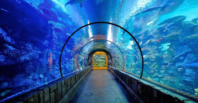
When I first saw this image it immediately made me think of the time I took my kids to the shark reef in Las Vegas. The yellow at the end of the walkway contrasts the overall blue of the rest of the image. The left side is a bit more shadowed and offers a deeper blue, again contrasting with the lighter blue, or less shadowed, water on the upper right and right side of the tank. The two white areas almost dead center in the upper portion of the image are representative of some form of light fixture, either natural or man made. Your eye is immediately drawn to the yellow square. The curvature of the tank offers a balance within the image. The two heavy lines on either side of the walk way offer a balance through the bottom and center of the image as well. The Law of Closure talks about how objects that are close together feel like a whole. The coral and fish is a perfect example of this. If you look closely, you can see the individual coral and fish, but when you glance at it quickly, if just appears as one big mass. The landscape orientation of the image helps give even more emphasis to the length and depth of the walkway and massive fish tank. Because let's face it, all this really is, is a big fish tank.
Thursday, June 2, 2016
Visceral Response
This photo is from the British Open and was published in Golf Digest in 2012.
Golf is a game of lines all around and this picture shows it perfectly. The grand stands are a line, the bunkers are lined up. The ball is even perfectly placed just outside the line of the golfers shadow. The club line is also on the perfect plain or line. The rough in front of the green is a line and so is the line of spectators behind the green.
Form and shape are all around in this picture. The depth of the bunkers, the volume of the stands, and the position of the golfer.
Feelings can felt by anyone that like to watch or play golf. I love this picture. This is such a hard shot, go long and your short sided and dead leave it short and your in the thickest rough in the world.
I also love the color in this picture. Golf fans can immediately tell its the British Open. In America we play golf on course that are green, very green with trees and water. Over the "pond" in the home of golf to save money their courses are played with the dead looking grass that gets baked out at the end of the day, that they don't have to water as much. Look at the different colors, the light green and dark green of the fairway, the light and dark green of the rough and the dark sky. I also love that you can tell the spectators are sitting in silence.
Subscribe to:
Comments (Atom)


